ON THE BIAS: Picture Superiority Effect
Welcome to the blog series, ON THE BIAS.
In this series, we look at the cognitive biases we have as humans and how they impact our behavior change efforts. Catch up with the previous posts on the IKEA effect, the mere exposure effect, and present bias.

A story: door jam
This story has happened to me more than once. Usually, it happens when I go to the bank.
I approach the entrance of double doors, grab the handle to pull the door open, and CLANK! The door rattles and doesn’t budge open, indicating that the building is locked.
Knowing I am within the window of regular business hours, I tug the door handle a few more times, producing several more loud clanking noises.
I peer inside the glass door. There are people in there! Why are these doors locked?
Then, I look more closely at the door handles and finally read the signs:

The door isn’t locked. I was pulling instead of pushing.
What’s happening here?
Part of what’s happening is that my brain and arm relied on system 1 thinking by instinctually grabbing a handle and pulling.
The visual cue of the door handle sparks this system 1 thinking.
My brain quickly absorbs the image in front of me of two protruding bars and processes that information as “bars to pull.”
This happens faster than my brain’s ability to read and process the written PUSH instructions.
This is called the picture superiority effect.
ON THE BIAS: We’re visual creatures optimized to process imagery faster than words. We not only process them quicker but also remember visuals for far longer than we can recall text.
How much is a picture worth?
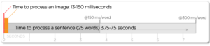
The old cliché is that a picture is worth 1,000 words. The internet will tell you that people process images 60,000 times faster than words.
This article explores the science behind these claims and finds that images are processed 6x – 600x faster than words.
If the PUSH prompt on the door included a helpful image so my brain could process the instructions faster, like the example below, I might have avoided much embarrassment.

I can feel my brain telling my arm to push just from looking at this image!
Bringing the bias home: Take a moment to think about the commercials, print ads, and social media posts you’ve seen over the past several days. What comes to mind first? Is it a key visual or a written text?
Your memory bank is more likely to surface visuals and sounds, like a catchy tune, than the text associated with those same ads.
Have you noticed that some social media posts create an image of written text by using an artistic font treatment, connecting the text to a meme, or simply taking a screenshot of a tweet?
That creates a cognitive shortcut to help us process and remember what we’ve read using the picture superiority effect.
How this bias can help or hurt our behavior change programs
Behavior change messages often compete with many other messages the audience receives. Think of all the ones you recall seeing during the “bringing the bias home” activity.
In addition, behavior change messages can be complex and layered, which leads us to rely on text-heavy statements to get all our points across.
But this approach ignores the reality that our audiences will be more attracted to images and will process the meaning of those images before they read any of the text.
Therefore, using the right image can make or break our behavior change program.
HOW IT HELPS
The picture superiority effect pushes us to think strategically about which image we choose for our message.
Ideally, it pushes us to determine the key visual BEFORE we craft the compelling message, as Sparky Witte suggests on LinkedIn:

The most significant opportunity here is to show the behavior we’d like to see from the audience.
If we want beachgoers to keep their distance from marine mammals and not encroach for a selfie, then we can lead with a key visual that instantly communicates that.
Like how the Amazing from Afar campaign featured more wildlife-friendly selfie styles.

Showing only an image of a seal with written text describing the desired behavior doesn’t communicate the whole story, which may lead the audience to pull instead of push.
HOW IT CAN HURT
A classic mistake we make in behavior change communications is showing an image of what we want people to STOP doing.
I understand the instinct. We want to say, “Hey, you! Are you doing this? If yes, then stop it!”
But the downside of this approach is that it has the opposite effect of what we’re going for.
When we feature undesirable behavior as the primary visual, then that is the critical message the audience walks away with. The brain processes the visual in association with the cause – not as counterproductive to the cause – which reinforces the wrong social norm.

While this poster leads with the headline “do not feed me,” the main visual shows a human hand feeding pigeons.
After passing this sign, most people will remember the behavior of feeding pigeons.
Not only does this reinforce the wrong behavior, but showing repeated images of the undesirable behavior normalizes it for the audience. If most people feed pigeons, then it must not be that bad to do.
I touched on this risk in the mere exposure effect post as well.
A NOTE OF CAUTION
Even though humans can process images quickly, it does not mean that we can process complicated images at that same speed.
Overly creative, cluttered, or confusing images require greater cognitive processing than we typically use to understand clear visuals. In an ideal world, this approach would disrupt the viewer and prompt them to explore further.

But the reality is that most audience members see our messages quickly and don’t have the time or mental bandwidth to dissect what the visual is trying to say.
Like the poster above. Why is a polar bear coming out of a smokestack? Is pollution creating polar bears? While it is visually attractive, my brain can’t easily comprehend its meaning. So, I shrug it off and move on.
Our audience does this, too. When faced with an image they can’t process quickly at face value, they walk away.
So, if we only have a second to communicate, then let’s make those seconds as impactful as possible.
I hope you enjoyed learning about one of the many ways we’re wired.